This is Why Google+ Failed

Many thought Google+ was going to curbstomp Facebook.
I took one look at the interface and knew it had limited life. Google just doesn’t get how to build a compelling interface for most of its products.
Here’s a great example: Hangouts.
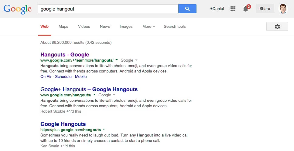
I just went to make one, like 5 minutes ago. Here’s the process.
1. I Google For Hangout

Pretty straightforward.
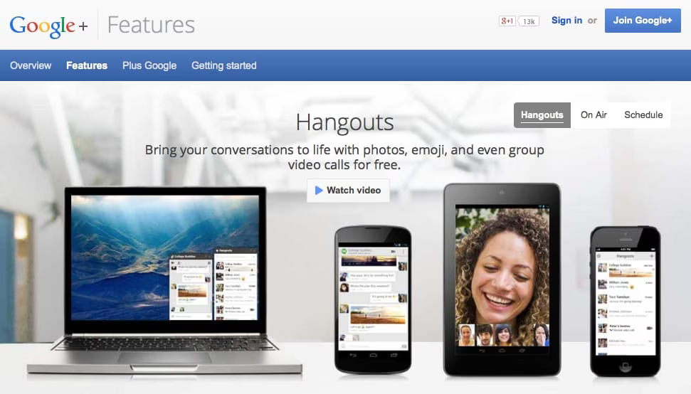
2. I click the link

Ok, so it’s showing me not logged in, even thought I’m logged in everywhere else with Google. Suboptimal, but not a big deal.
3. Click the login button

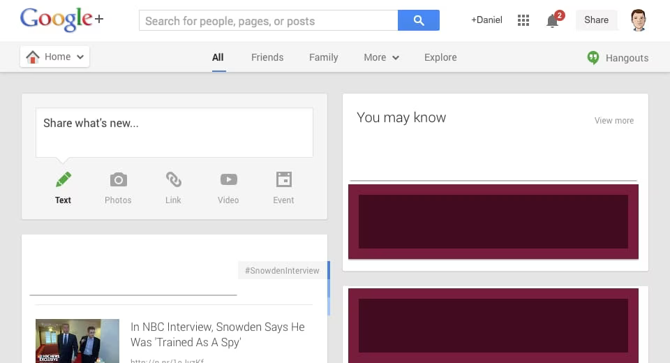
WTF.
I’ve been dropped in the Google+ page? How do I start a hangout? Where did the hangouts page go?
THIS is why Google keeps failing in user-facing, design-oriented projects. They don’t get fundamentals. They seem to arbitrarily make decisions about how applications should behave.
Oh, and by the way, if you go backwards and start over, the same exact workflow happens again. When I hit the Hangouts page I’m still not logged in, and logging in takes me right back to Google+ (with no links to Hangouts).
Infuriating.