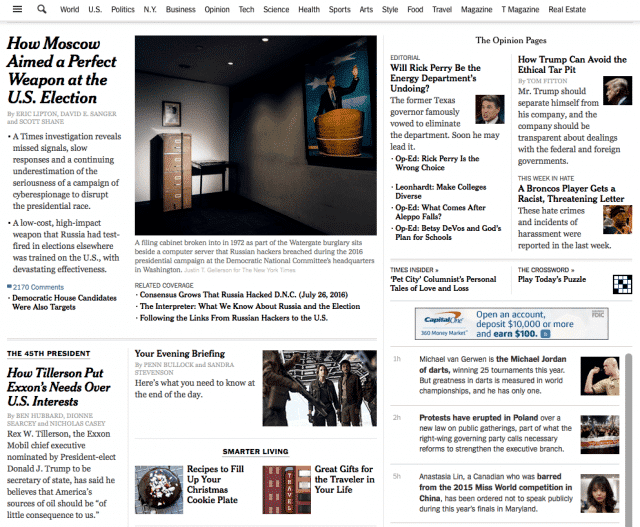
Standardizing on New York Times for Core News Input

For the last several years my muscle memory has taken me to CNN as my main news source. Whether I was on my mobile device or on the laptop, it’s just always been my default.
I just ended that practice.
There are a number of reasons, but I think the biggest one is that it just started reeking of entertainment. The story titles were blatant clickbait. You’re blasted with autoplay videos everywhere you go. And the depth of coverage leaves much to want.
There’s also the issue that I felt like it was time to put support behind real journalism. Not that I doubt most of the people at CNN are journalists—I’m sure they are. But I think the New York Times represents the best of journalism, and CNN does not.
I am aware of some bias with the NYT. I think it is a bit too left for me in a number of areas. But they’re areas I hope to be able to navigate either by not reading that content or by supplementing it with my other inputs. I will continue to consume dozens of other sources in addition to NYT via RSS.
There’s also a practical reason to make the change: I buy the paper subscription for my Dad, and I have the bundle that gives you digital with it. It’s a fantastic deal. So I plan on making use of it.
Finally, there’s a reason I’m more hesitant to share—I freaking love the typography. To me it is a solid indication of meticulous curation and attention to detail. It magnifies the content for me. I will try to fight that bias, but I will lose.
Anyway, I’m looking forward to getting to know specific perspectives of the columnists, as my Dad has, as well as figuring out which parts of the paper I enjoy most.
I’ll try to report back how the experience goes after, say, a few months or a year. And if you are already a schooled consumer of the paper I’d appreciate any tips.
Notes
One question I’m already debating is whether to use the default page or to use the app.nytimes.com view, which is far more simple of an interface. Would appreciate any feedback if you use one or the other.
This also corresponds with a purge of Facebook. I don’t have the app on my home screen (it’s hidden away in Overflow) and I seldom open it. It’s like eating M&Ms for breakfast, lunch, and dinner—for nine months in a row. You’ll feel like crap, but won’t be able to eat anything else because it doesn’t taste like M&Ms. Dump it. You’ll be happier.
I think one reason I’m leaning towards the standard edition rather than the app.nytimes.com edition is that I can do speed-reading with the former and not the latter. It also seems more true to the way they want you to read it.