Site Redesign 2017
December 13, 2016

It’s been quite a while since I’ve messed with my design, but I finally got inspired to make some changes.
Here’s a short list:
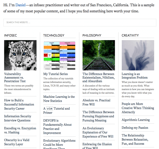
I turned the main page into a table of my best content.
For lists of things, like Projects >, Reading >, and Tutorials >, I turned those into tables as well.
I tightened up the Blog > layout, showing more posts and smaller thumbnails.
I’ve been cleaning up the sidebar for a couple of months now.
Essentially I tried to make things easier to find, and more pleasant to look at. Been on a typography kick again lately.
Anyway, it feels like a decent upgrade going into 2017, and if you have any thoughts on the design—love it or hate it—do let me know.