Anatomy of a Single Page iPhone Homescreen

I like clean interfaces, and I’ve attempted to extend this to my mobile device.
With iOS 8, Apple’s mobile search features (via Spotlight) have improved greatly. What I’ve done is leverage Spotlight to get my homescreen down to one page.
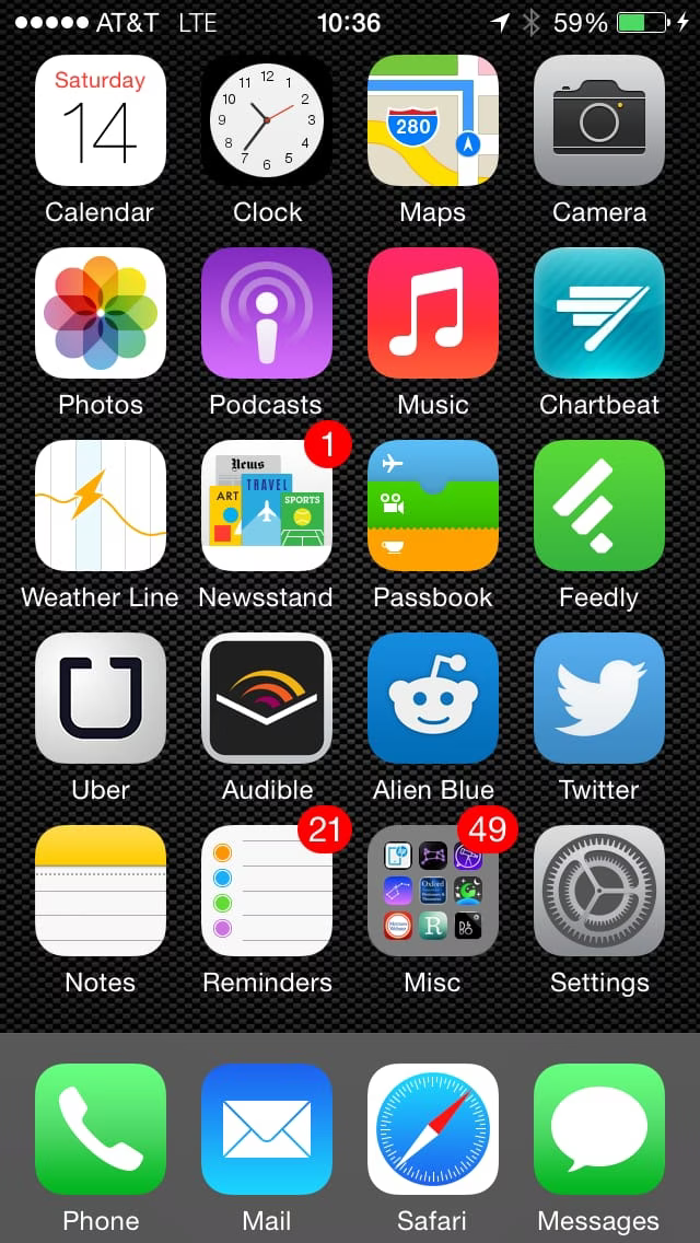
Here’s how I have my apps organized on that single screen:
The overall concept is that there are two high-priority areas: the top two rows (because the eye naturally goes there), and the area closest to my thumb, (bottom right, as I’m right-handed).
The second concept is organization from right to left, so things on the right side of the screen should be more commonly used than those on the left.
The third concept is that things on the edges are accessed faster than things in the middle.
So we start with Calendar, Clock, Maps, and Camera at the top. The Camera is on the right, due to the thumb-proximity and edge-access rules.
Next we get into high priorities that are major, but don’t need to be accessed quickly, e.g. Photos, Podcasts, Music, etc.
Then we get to the area that’s closest to the center and bottom-right. Feedly and Passbook are positioned there for easy access.
Next are Twitter and Reddit, with Uber and Weather available to the left of this and the previous row.
And finally Notes, Reminders, and the Misc folder that holds all other apps on the device.
[ NOTE: While it’s trivial to reach all icons on the current iPhone, this model should scale well to the 4.7 and 5.5 inch models as well. ]
The idea of this layout is that 95% of what I do on my phone should be one or two touches away. For the other 5%, I usually start by swiping down on the main screen and typing a few things into Spotlight.
Alternatively, I can invoke Siri and avoid the keyboard altogether.
Comments welcome. I’d love to hear from others who have optimized to a single screen of icons, and/or used another method.