NYC Crime Visualizations
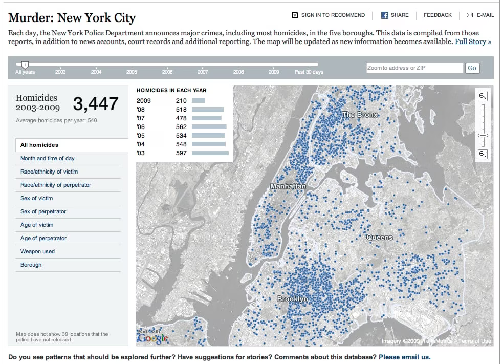
Few things get me as excited as data visualization. I seriously love the stuff, and this project by the New York Times > is excellent. It shows homicide data for the NYC area over the past several years, broken down by age, sex of perpetrator, sex of victim, race of perpetrator, race of victim, weapon used, borough, time of day, etc.
Really cool stuff.

At the bottom it says, "Do you see any patterns that should be explored further?" My first inclination is:
I mean, seriously. 90%? I find it amazing that the NYT can publish such staggering stats and then put out op-ed columns about how the NYPD unfairly targets black and hispanic people.
This is a textbook example of the moralistic fallacy >, which is the most common intellectual offense committed by liberals. This fallacy puts forth the idea that things are, in reality, the way they should be. In other words, that the police should scrutinize a young asian kid in a suspicious situation the same way as a young black kid–because there shouldn’t be any reason to evaluate one more than the other.
But reality clearly says otherwise, and I applaud any effort to shed light on the truth–regardless of how unpleasant it may be. It’s much harder to argue with data when you see it displayed in this way.
Now if we can just get some gun control vs. concealed carry data. I really want to make some progress on my opinion on that matter. ::