Newsletter Analysis: What My Favorite Newsletters Have in Common

I read a lot of newsletters as part of my content consumption workflow, and since I have my own newsletter as well (started in 2015 before it was cool!), I’m hyper-curious about what works and what doesn’t.
More specifically, I see lots of similar tricks being used across the 20-or-so that I subscribe to. These are things like having a personal intro, a custom subject line, asking people to share, using links within the copy, running a referral program, etc.

Attribute breakdowns
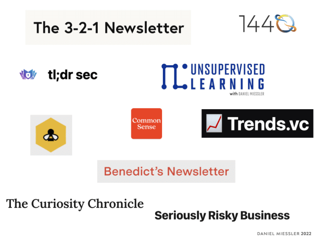
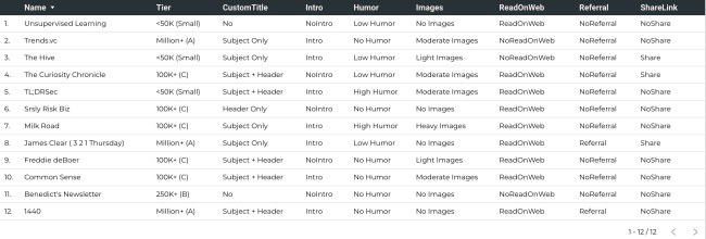
So I decided to take my top 10+ newsletters, break down those tricks as features, and put them in a spreadsheet.
The main two purposes I had were:
Learn what the common tropes/memes that are spreading within top newsletters
Look for things that my favorite people are doing with their newsletters that I am not
…and here’s the full list of attributes I looked at:
See the raw data >.

Click to enhance
Use of images
A personal intro
A table of contents
Inline links
Newsletter size
A newsletter value prop
A custom title per episode
A referral program
A call to share
A link to subscribe
How much humor is used
The type of ads used
The tech platform
Use of an inspirational quote
My takeaways
I also just wanted to play with the raw data > Google Sheets and Google Data Studio >.
Most Top Newsletters Have a Value Proposition: This means a short blurb at the top that reminds readers (especially new subscribers) what value the newsletter is bringing them.

All Three Top-tier Newsletters Include an Intro: This is a decent signal that those who don’t (including me) might want to include one.
All Three Top-tier Newsletters (and the majority) Use Custom Email Subjects and/or Headers: This is where each episode has a tagline that tells you what’s in it. It takes more time but the top offerings almost universally have it.
Only Super-long Newsletters Tend to Have a Table of Contents: Of the biggest three that I follow, only Trends.vc has a table of contents. And it’s basically a giant index of content so that makes sense.

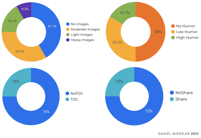
Very Few Newsletters Have Referral Programs: Only two out of the 12 have them, but I expect this to change shortly. I’m adding a program to mine very soon as well.
Most Don’t have a Sign-up Link, Probably Because They Assume Someone Reading is Already Signed Up: Two of the three top don’t have it, but 1440 does. The idea is to catch people who had the newsletter forwarded to them.
Most Have a Read-on-Web Option: This still seems important for some people, since the majority still include it.

Three of My Top 4 Have No Images: While there are a number of newsletters that have images now, it seems like the top ones are still mostly text.
My Top 4 Have Virtually No Humor: It seems like mass-appeal skews towards being neutral, and humor isn’t neutral.
Substack Had the Highest Platform Representation: This was followed by Mailchimp.
To make this prescriptive, if you run a newsletter I recommend you do the following.
Unless you’re over a million subscribers, include a value proposition
Consider opening with a brief, personal intro
Use a custom email subject that describes the episode
Consider getting a referral program to jumpstart growth
My top 4 recommendations
You should obviously consider following every newsletter I mentioned here, but here are my must-haves:
1440—Unbiased, broad-spectrum news. Subscribe >
3-2-1 Thursdays—A concise, inspirational newsletter by the author of Atomic Habits. Subscribe >
TLDRSec—An ultra high-quality newsletter focused on application and cloud security. Subscribe >
Unsupervised Learning—My own newsletter that combines news, analysis, and original ideas in security, tech, and society. Subscribe >
Thanks for reading, and I hope this helps you on your journey.
And if I missed any newsletters or attributes you think I should add, please let me know >.