How Technology Increases Production Without the Need for Humans

Over the last several years I’ve been reading extraordinary amounts about the future of artificial intelligence, and how it’ll affect human work. I’ve written about this extensively here, so feel free to explore if you’re interested.
Recently a reader reached out and pointed me to a video by Moshe Vardi of Rice University. The reader was himself a Ph.D. in AI, and he too went to Rice University. Anyway, he said that this lecture he saw there had a major impact on his view of the topic.
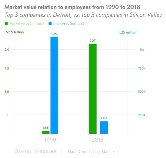
This is an updated version of that talk by Vardi, and one of the rather side points he made in the previous version was a comparison of the top 3 companies in 1990 in Detroit, Michigan vs. the top 3 companies in Silicon Valley in 2016. He basically calculated this across two dimensions: amount of market value, and number of employees working at the companies.
The chart was staggering, so I decided to update it for 2018, and that’s what the chart above shows.

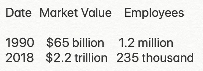
Market value to employee comparison for three top companies in each time
So, for two of the top economically producing regions in the United States, from 1990 to 2018, we went from each employee providing around $54,000 dollars in value, to each employee providing $9,361,000 in value.
That’s roughly 173 times the level of productivity.
So forget AI—let’s take that off the table since it’s just getting started anyway. Just looking at technology and automation we’re seeing staggering amounts of value being created by fewer and fewer employees.
And there’s no reason to think this won’t continue—and accelerate—as ML/AI makes the tech even better at replacing humans.
Notes
I made this graph myself, by hand, using a style copied from Atlas Graphs >, which I find to be super clear and visually attractive.
I think I need to factor in inflation as well to make the comparison more accurate.