Features I Need in Feedly

When Google Reader died I cried a lot. Not sure why you close the best RSS reader in the world but leave Google Wave Talk Hangouts to walk the earth.
Anyway.
When I was done mourning I started looking for a replacement. None of them were too exciting, but I finally settled on Feedly >.
I’ve been mostly happy with it, but there are a couple of features it lacks that seem super powerful and obvious to me. I’m going to capture them here and treat them as feature request documentation. Because internet.
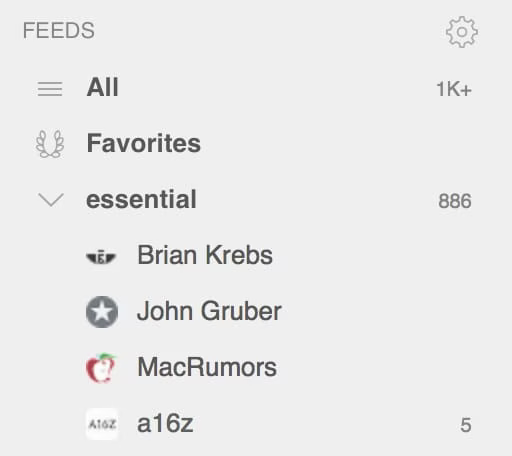
1. Reorganize the order that feeds appear

The first thing I’d love to be able to do is list feeds in the order that I want. This should have been the first feature, not something that still doesn’t exist years after launching.
To put it another way, this is a product focused exclusively on organizing information, and yet ALPHABETICAL is the both the default and only option for listing them. It’s ridiculous.
I beg you to stop whatever wutang backflip roundhouse you’re working on and put this step 0 functionality in there as soon as possible.
2. A slider bar for popularity
Time is a precious thing, but sometimes we have a lot and sometimes we have a little.
I produce a podcast and newsletter called Unsupervised Learning >, and that generally involves me reading hundreds or thousands of potential headlines to find the few stories that go into the show each week.
Sometimes I can read thousands of stories over 5 hours. Other times I need to get maximum content in minimum time.
A great way to handle this would be to let me move up or down on a slider of popularity, as measured by shares. As you move to the right (more popular) you get fewer stories because it filters stories that don’t have at least N number of shares. And as you slide to the left you filter fewer and fewer until you have all stories.
I need this. Everyone needs this (even though they don’t know it yet). Please make it.
3. A slider bar for recency
A similar concept would be fantastic for time. This functionality already exists to some degree with "older than N" filters, but it’d be nice to have a more quantitative and visual option there as well, or some sort of hybrid.
So as you move to the right things the older items drop off, and as you move to the left you have everything ever published from those sources, and as you slide you see the number of days that you’re viewing at that level.
[ NOTE: Actually, what would be super cool would be a two dimensional graph where you could move up/down for popularity, and or right/left for recency. It would be super elegant, although the UX could be a challenge. ]
Summary
Let us change the order of feeds. Alphabetical as the only option in a news reader is like going to a high-end typography course and discovering they only use Arial and Times New Roman.
Let us filter on how many shares the stories had.
Let us filter on how recent the stories were published.
(nice to have) Perhaps a visual way of combing 2 and 3 using a two-dimensional graph.
And finally, thanks for the product as it is today. It’s already pretty great.
No related posts.