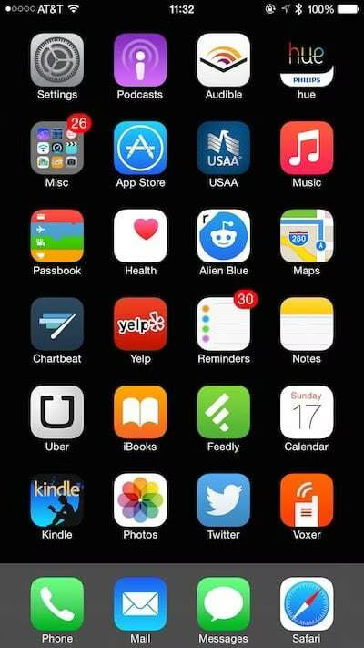
Anatomy of an iOS Home Screen

Optimizing my iOS workflow is a yearly activity for me. I’m always trying to extract just a little more efficiency from it, which usually happens on major OS releases and when I get a new device.
Here are my current binding concepts:
One screen of apps. Not two. Not three. One. For everything else I have the downward swipe and search. I think it’s just cleaner.
Only one folder, which is for every single thing installed that isn’t on the one home screen.
Minimal installs. I only have a couple of dozen applications installed, and the standard for installing another is fairly high.
Thumb-centric layout. Rather than group apps by similarity, I group them by how often I access them with one hand, meaning how easy it is to get to frequently one-hand-accessed apps with just my left or right thumb. This means that the bottom right and bottom left corners are the hottest locations, reaching up to the middle of the device.
The other hot spots for me are edges, as they require less visual searching. The right edge is a major line for me, so I have many of my key apps there—with the bottom being highest priority.
Applications at the top of the screen are there to be launched with my index finger while the device is either flat on a table or mounted in my car. So I put the apps at the top that are least likely to be thumb-accessed.
I have removed the Clock and Camera applications from the home screen because I need that real estate for other apps and they are available via the bottom swipe. Bottom-swping is, by my estimation, the fastest way to get to the camera anyway, since you don’t have to authenticate.
So what I’m left with is one screen of apps that I can get to easily one-handed, that also works well when the device is flat or mounted. All other apps I get to either by down-swiping and typing one letter, or by using Siri >.
I don’t think my system is optimal. I’m sure I’m missing some key tweaks that could be made; plus there is the matter of personal preference. But if you have a similar or competing system and think you can improve on this, I’d love to hear about it.
Notes
My device is an iPhone 6 Plus, so the thumb-centric piece is critical. If you don’t hold the Plus securely it’s easy to drop.