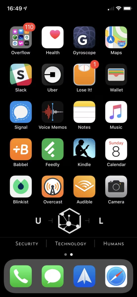
Why I Use a Single-screen iPhone Configuration

There are lots of ways to organize the apps on your phone. You can have lots of screens of single apps, or you can have lots of screens of app folders, or you can have something in-between.
I do something simpler. I have one screen of apps, and everything else I have to invoke via the down-swipe.
Not only do I only have one screen, but the bottom row is empty, so it’s actually less than one screen.
This does a few things for me:
It’s more efficient to swipe down and type one or two characters than to search through multiple screens or folders.
Often times, when you swipe down to search for the app you want, it’s already there in the list at the top.
It constantly re-affirms my priorities. The apps I have on my (one and only) home screen are apps I am happy to spend time in. Everything else I want to have to spend effort to find and use.
A number of my time-wasting apps, like Reddit, News, and New Yor Times, are not on the home screen, so it’s harder to mindlessly click on them and disappear into a time warp.
This is a good thing.
Having a single screen of apps is a way to ensure you’re spending time on what you care about rather than what comes naturally.
This setup is also just far more efficient. You think having a hundred apps right at your fingertips on various screens is easier than searching, but this stops being true once you have two or three screens. Once you hit that threshold it’s faster to search, especially when the OS is predicting what you’re probably looking for.
In short, this setup keeps me both focused on what I want to be doing, as well as efficient when I do need to find an app that I don’t often use.
Try it out. It’ll feel weird at first, but if you can get past the rough part I think you might enjoy the simplicity of it.
Notes
The text at the bottom of my screen is part of a custom wallpaper I made to look like it’s part of the phone.