Web Design: The Most Important Usability Change You Haven’t Made Yet
I have a new design philosophy. It’s called 100% Easy to Read >. Here are the highlights:
Don’t tell us to adjust the font size
Don’t tell us busy pages look better
Don’t tell us scrolling is bad
Don’t tell us text isn’t important (95% of "web design" is typography >)
Don’t tell us to get glasses (use a font-size that’s large enough)
Here are the 5 basic rules:
Standard font size for long texts
Active white space
Reader-friendly line height
Clear color contrast
No text in images
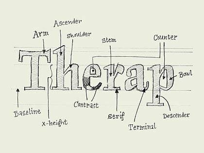
There are two other concepts that jumped out at me: using text as an interface, and the understanding that typography is not the art of selecting typefaces. Typography > is so much more.
I’ve been thinking a lot about the presentation of my text lately. Until now it’s been about the formatting of the text within the post itself, but now I’m thinking more about the look of the entire page and site.
I’m going to be doing a lot with this in coming weeks and months. I at least have an idea of what I want; now I just need to get there. I thank the heavens for CSS.: