Medium is the Bud Light of Typography
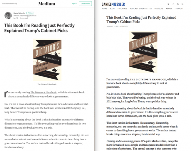
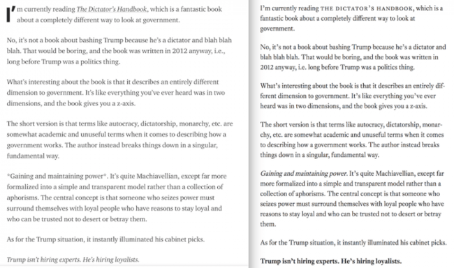
I’ve been working on my new site design and was eager to show off my new typography, so I took a screenshot of the same content in Medium right next to the same content in my new site theme (see above).
Remarkably, and to my utter dismay, most people said they liked the left one because, "it was easier to read."
I went through all the stages of grief.
These people are stupid!
I probably set up the screenshot wrong.
Many people have bad taste; and my site is for people who have good taste.
Shit.
Then I realized what could be happening.
Medium is banking on having every site have a similar look and feel, and they want that single look to be consumable.
Kind of reminds me of Bud Light.
Have you ever heard anyone who loves beer say that Bud Light is their favorite? Not many. But what’s easier to drink 12 of while you’re golfing—Bud Light or Guinness?
Right.
Guiness is more loved by people who love it, but hated by far more because it has character.
Medium decided to eschew character in their…well, characters. So what they have is plain, bland, and highly approachable. That’s one read on the whole thing.
But then I had an even scarier thought: What if my site design looks beautiful but isn’t functional? Isn’t that possible? A beautiful object that has a bad design?
Or, in other words, isn’t it possible for something to have a strong and attractive aesthetic while being hard to use?
Is that my problem?
Or is it that it’s more attractive and easier to read, but it’s still a designer beer and most people don’t like beer and prefer Bud Light?
And how much of a difference is there in that distinction?
All this bellybutton gazing has a purpose. If my site is beautiful but hard to read I’m going to change the typography. Nothing would disturb my internal peace more than creating something as a pinnacle of design that was hard to actually use.
But at the same time, if the new design just takes a moment to get used to and suddenly feels far more pleasant to the reader (like a good beer) then I’m absolutely going to stick with it.
Basically, anyone into typography would instantly prefer and respect the design, and people not used to it would come to love it within a few seconds.
The problem is that I don’t know which of these is true.
Oct 15, 2017 — I had a bunch of comments (thank you) and the consensus seemed to be that the font on the right was a bit too heavy, so it looked like the reader was being shouted at. Here’s an update.