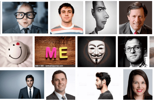
The Hierarchy of Public Social Media Images
I think there’s a hierarchy to the images that people use to represent themselves on social media like Twitter.
Here are the levels, from least to most mature.
An icon or image that makes you look cool (Matrix Digital Display)
An icon or image that’s kind of interesting or cute (A Snarling Dog)
A highly modified picture of yourself that makes you look super cool (think Prisma)
A slightly modified image of yourself (good angle, great clothes, etc), probably not smiling.
A very slightly modified image of you, in an artistic way, looking away from the camera like you’re pensive.
An extremely direct image of you starring right at the camera and smiling.
Explanation
I think what this comes down to is comfort with oneself. When you’re young and/or insecure you tend to show yourself in more abstract ways. And as you mature you start be a bit more comfortable showing yourself as you are.
The final form of this is just you, not pretending to be indifferent or cool or anything in particular. It’s just you smiling at the world.
Notes
I’m stuck somewhere between 4 and 5. Looking to get to 6 soon.
I wrote this in like 200 seconds; don’t take it too seriously.