Font Size on Top Web Publications
Is that text above, or is it the result of a smallest printing head competition?
I think publications that think too much of themselves use excessively small font sizes in order to be less approachable. It’s part of a series of techniques for being "too hard to get into" that pseudo intellectuals (and unfortunately many real ones as well) use to appear important.
The less approachable it is the more valuable it is. Boarding school. The Mason temple. 4.5 pixel fonts. Same story.
Examples:
Dense writing. If you write to be impressive, so that you must be trained to even parse the dung–you have failed as a communicator and you are likely hiding a lack of interesting content.
Use of nauseating vocabulary. Again, if you’re trying to impress with your choice of words rather that their content, you’ve failed.
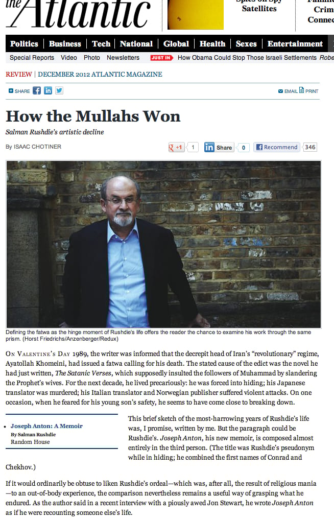
Small fonts. See screenshot above.
Pay walls. Acting like people should have to pay to read your stuff, because you’ve got five degrees, is the opposite of academia. It’s the opposite of learning for the benefit of others. It’s the opposite of good.
If you have something valuable to say, say it plainly. Use 7-dollar words when they serve a purpose–not just to show that you have them. And for the love of god–make the text legible.