First Impressions of the Superhuman Email Service

Like many others, I’ve been observing the hype around Superhuman > for a while now. I signed up to get on the list forever ago, but forgot about it until a member sent me an invite a few weeks back.
Looks like the marketing worked.
That’s when I found out it was $30/month, which seems exorbitant in the current market. So much so that I was curious whether it was worth it.
Setup

So one thing that was interesting about the setup is that you can’t just download the client, connect it to your Gmail, and be on your way.
Sep 7, 2019 — I now think this was essential to me learning how to use it.
Nope—you have to set up a consulting appointment and have someone walk you through everything.
Having gone through it, this serves three not so subtle purposes:
It makes sure you know enough about the product to not think it sucks just because you don’t know how to use it.
It makes it feel like the product was (somewhat) customized for you, which makes you feel (somewhat) special.
It onboards you enough that you feel like you have some momentum with it already.
There’s a weird cult-like feeling to it actually. It makes people want to use it just because others aren’t, and you’ve seen behind the scenes, and you’re doing things with your email that others can’t.
Don’t underestimate how powerful this effect is.
Oh, and if someone makes fun of you for paying $30 bucks a month for it—that’s becasue they just don’t get it.
wink wink
Anyway, I see this as a massive inoculation against trying the service and cancelling. It’s almost like Elysium, where you want to stop paying the $50/month but you also don’t want to be the dumbass who stopped paying for something that actually helps.
It’s ingenious marketing.
Anyway.
The email clients

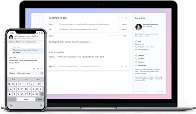
So there are two clients: a desktop client and a mobile client.
I’ve been a Spark user for quite some time, and that seems to be their main competition besides Gmail itself, so a good amount of the features seemed somewhat familiar from that.
A good example is the swiping left or right to perform certain actions.
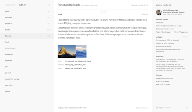
Overall, the basic look and feel of the clients seemed very similar to Spark, with a few exceptions.
Superhuman is cleaner and faster than Spark.
Spark has more features (see above).
Superhuman is more ambitious (see below).
Superhuman is truly trying to change email
The thing that grabbed me during the consultation was that my associate was seriously versed on email workflows, and productivity research, and even pushed back on the way I was doing things.
I was like,
Yeah, I like it this way because X and Y.
And he came back immediately with,
Well, we don’t recommend you do it that way. We built everything around doing it this way instead, and I suggest you at least try it that way.
He wasn’t rude about it, but he wasn’t playing either. He was serious. He honestly believed that this way (archiving vs. leaving things in the inbox) would make a massive difference.
Part of that is just being a good account manager. You don’t want people canceling because they didn’t see much benefit. But another part seemed to be a genuine desire to see people do email in a different and better way.
I liked that.
What Superhuman does better than any other client

So here’s what I absolutely love about Superhuman.
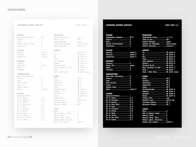
It’s designed for keyboard interaction.
Not a little bit, but from the ground up. I can use Vim commands to navigate mail. Escape is a major player in the workflow. There’s a central command invocation interface (Cmd-K) that presents you tons of options.
And in general it’s just clearly designed to be used with high efficiency. And that combined with the philosophy of Zero Inbox, archiving vs. letting things accumulate in the inbox, etc., all make it a truly different thing.
It doesn’t feel like just a slightly faster and better Spark or Gmail. It feels different enough to be its own thing, which is admirable given how little has changed in email clients since Gmail came out.
Thoughts
See my updates to the post below.
I’m still in my first day, so I can’t tell you much more than these first impressions.
I’m actually already an Inbox Zero guy anyway, so that won’t be one of the switches.
Most importantly, I can’t tell you if it really will change anything about my workflow, or if it’s going to pretty much be email as usual. But I will update this post with thoughts after 1-3 weeks.
Summary
It really does feel different than other offerings.
$30 is a lot of money, so it better be a lot better.
Absolutely love the Vim-y feel to the interface.
Loved the true belief and conviction from the onboarding team.
I don’t love the sneaky lock-in techniques, but I understand them.
Ultimately, I think it’s worth trying out if you are willing to honestly try a better way of doing email.
But if you’re just looking for a better version of Spark, it’s probably not going to be worth $360/year.
See you in a bit for the update!
Update: Sep 6, 2019 — So it’s been a couple of days now and honestly it’s becoming pure bliss. The shortcuts are better than I could have imagined (it reminds me of my Mutt days), and I’ve converted to complete Inbox Zero by archiving absolutely everything. I think I’m definitely going to become a permanent customer. More updates to follow.

Update: Sep 7, 2019 — Loving the gorgeous backgrounds when you hit Inbox Zero. Here’s my summary so far, which could almost serve as a marketing line: It’s cleaner than Spark, faster than Gmail, and with an artistically minimalist design! Only thing I would like is the ability to customize some of the shortcuts, so I can make it even more like Vim. And an integrated inbox for multiple accounts. More updates to follow.