5 Ways to Instantly Upgrade Your Online Typography

Typography is the visual component of the written word. ~ Eric Spiekermann
Using good typography is an easy way to upgrade your writing. While you can do a lot to make it beautiful, this short guide will show you how to avoid major mistakes that detract from your writing. Doing these five things will make your content far more attractive to your readers.
I really wish I knew these before I wrote around 7,000 posts going back to 1999.
Here are the most common errors to avoid, in the order of severity and frequency:
Using a small, sans-serif font for your body text

Small Sans vs. Larger Serif
The Serif bit means that the characters have little connectors on them that link them to the next. This lets your eye more easily flow from one character to the next letter.
TL;DR: Use a lager, serif font for your body text.
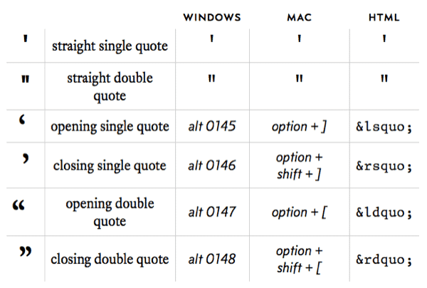
Using the wrong quotation marks >

From Butterick’s guide to quotes
TL;DR: Good typography traditionally used curly quotes, but we had to ditch them during the typewriter days because there wasn’t enough space on the keyboard.
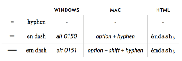
Using hyphens and dashes > incorrectly
In Markdown, three hyphens make a full dash, and two make a short one.

TL;DR: Hyphens are for words that break into multiple lines and for multipart words. Short (en) dashes are for ranges of values or connection/contrast between words. Long (em) dashes are to indicate a shorter pause within a sentence than a colon, semicolon, or parenthesis.
Using three dots instead of an ellipsis >

TL;DR: Three periods together are too close together, and three periods with a space in between are too far apart. An Elipsis is just right, and (as a bonus), it’s only a single character.
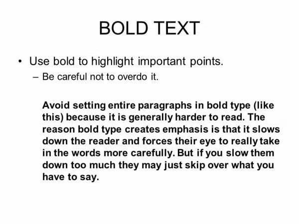
Overusing bold or italic

Too much cowbell
TL;DR: Accent only works if it’s uncommon. If everything is important, nothing is.
Recommendations
If you’re using a CMS, I recommend installing a plugin that lets you write using Markdown.
Butterick already has the perfect list of key typography rules >, but the goal here is to focus on just a few. Here’s my own, curated list.
Use a larger, higher-quality, serif font for your body text.
Use "curly quotes" instead of straight quotes.
Don’t confuse hyphens and dashes.
Use the actual Elipsis character instead of multiple periods.
Don’t overuse bold or italic.
Doing just these few things in your online writing will make it far easier to read and more attractive.
Notes
If you are into typography, the single best resource online is Practical Typography >, by Matthew Butterick.